For me, one of the highlights of working in a full production animation studio has been participating in the cumulative creation of a work of art.
The assembly line production involves the specialized talents of (among others) the writers, voice actors, layout and storyboard artists, designers, colorists, and animators. I've had the pleasure of working in studios where all stages were populated by friends and co-workers all under one roof. When everything clicks, each stage is inspired by and builds on the successes of the previous and adds additional layers to the visual narrative.
The same principle holds true for my comic book "Feeding Ground" in which, as a first-time creator, I'm responsible for the layout, pencils, inks, colors, and lettering that service the story I've developed with Jonathan Lang and Christopher Mangun.
I recently finished drawing the first issue. Since I'm the sole artist, I not only need to plan and execute in anticipation of each stage of production, I have to make sure that I build on what came before.
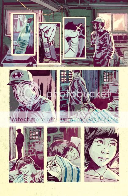
 The first rule of coloring is to accentuate the information you've already established in the inks. Light sources, focus, composition, and the depth of the panel were all in mind as I drew the page and now I should follow those guidelines while laying in color. Work against them and a page that felt dynamic and spontaneous becomes flat and heavy or, worse, confusing.
 I found artist and art director Mark Chiarello's portion of "DC Comics Guide to Coloring and Lettering Comics" to be a helpful primer in terms of getting into the mindset and specifications of digital coloring for comics.
In the next two posts I'll cover some of what I've learned in terms of the basic application of color and, more importantly, how I want to treat color as an element as equally active as the drawing and writing in terms of communicating the narrative of "Feeding Ground."


 to a sports car chassis