

And, here you have all three pages of my homework assignment for Klaus Janson at his MoCCA "Storytelling for Comic Artists" class.
The drawings are a little rough, especially as I got rushed for time towards the end, but the goal, implementing his lessons for clear storytelling, should be evidenced in these pages.

 How did I do?
Well, I picked up on a lot of fundamentals that seem inherent to concise storytelling and the class confirmed what I had already discovered on my own: comic art is equal parts drawing and problem solving.
Fortunately, Klaus has been teaching and plying his trade for some time and was able to break it down in handy lists and essential truths. I'll share some more observations next week, but, for now, some thoughts on his comments regarding my homework.
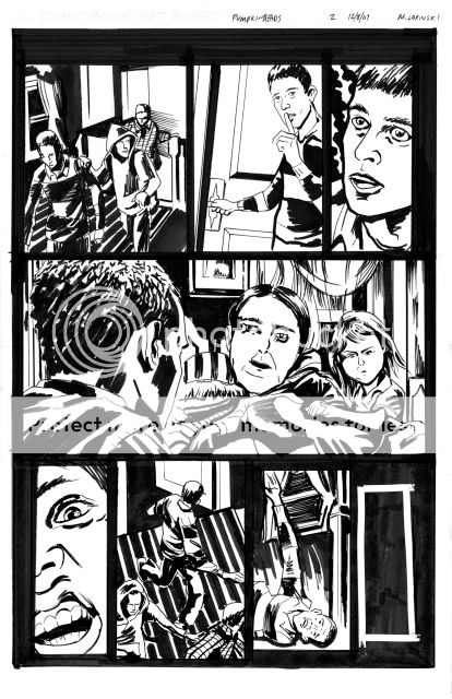
In general, he gave positive feedback to my spotting of blacks, cropping, and camera placement but pointed out where certain panels felt "flat" (ie. Page 1, Panel 2). In terms of storytelling, he rightully questioned the right to left direction of P2, PNL1 and pointed to the need to show the door in Panel 1 to set-up Panel 2.
He felt that the Pumpkinheads themselves should have been scarier, more shocking in appearance. I'm not satisfied with my rendering of them but pictured them to be more pitiful than scary to undercut the horror. Nonetheless, they needed to be freakier with a more apparent mutation.
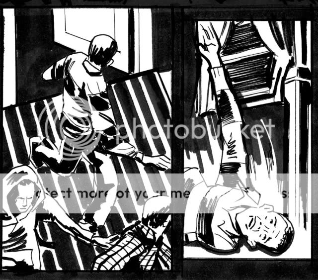
Finally, I needed to have set up the fall of the kid on P2, PNL 6. It's unclear what he trips over and violates one of those comic truisms - any new information (ie. the object he trips over) needs to be set up one to two panels before you use it. I tried to give him an off-balance posture in the previous panel but could have actually shown his foot getting snagged to clearer effect.
For me, I would re-board the last page. I definitely wanted to start this page with the kid waking but don't feel as if I properly balanced my shots. To do it again, I would start tighter on the kid's face and more clearly pull out with each panel, much wider on the two-shot with him and the girl to lead to the cut to the exterior. I would then NOT have the last panel bleed out and instead treat it as a smaller inset panel to give the suggestion of isolation and hopelessness.

One touch I added was to have vines already start to creep up the SUV to suggest a passage of time and a slightly supernatural force at work. It's something I'd confirm with the writer first but it was my way of having the art bring an additional layer to the story that wasn't overtly called for in the script.
Thanks to Klaus and Danny Fingeroth, comic writer and editor-emeritus and director of education at MoCCA, for setting this up and sharing their knowledge.
No comments:
Post a Comment