Tuesday, December 22, 2009

HAPPY HOLIDAYS and Uncomfortable Pin-Ups


Hey Everyone - Hope you have a relaxing and joyous holiday with your beloved friends, family, and animals. I'll be back next week with a coda to the Klaus Class posts.

For now, here's my holiday card and some oddly lascivious takes on some pop culture figures.


JOKER (re-imagined)


WILD THING JUDITH


BUFFY the Vampire Slayer


Friday, December 18, 2009

My Evenings with Klaus _ PART 3


And, here you have all three pages of my homework assignment for Klaus Janson at his MoCCA "Storytelling for Comic Artists" class.

The drawings are a little rough, especially as I got rushed for time towards the end, but the goal, implementing his lessons for clear storytelling, should be evidenced in these pages.


How did I do?

Well, I picked up on a lot of fundamentals that seem inherent to concise storytelling and the class confirmed what I had already discovered on my own: comic art is equal parts drawing and problem solving.

Fortunately, Klaus has been teaching and plying his trade for some time and was able to break it down in handy lists and essential truths. I'll share some more observations next week, but, for now, some thoughts on his comments regarding my homework.

In general, he gave positive feedback to my spotting of blacks, cropping, and camera placement but pointed out where certain panels felt "flat" (ie. Page 1, Panel 2). In terms of storytelling, he rightully questioned the right to left direction of P2, PNL1 and pointed to the need to show the door in Panel 1 to set-up Panel 2.

He felt that the Pumpkinheads themselves should have been scarier, more shocking in appearance. I'm not satisfied with my rendering of them but pictured them to be more pitiful than scary to undercut the horror. Nonetheless, they needed to be freakier with a more apparent mutation.

Finally, I needed to have set up the fall of the kid on P2, PNL 6. It's unclear what he trips over and violates one of those comic truisms - any new information (ie. the object he trips over) needs to be set up one to two panels before you use it. I tried to give him an off-balance posture in the previous panel but could have actually shown his foot getting snagged to clearer effect.


For me, I would re-board the last page. I definitely wanted to start this page with the kid waking but don't feel as if I properly balanced my shots. To do it again, I would start tighter on the kid's face and more clearly pull out with each panel, much wider on the two-shot with him and the girl to lead to the cut to the exterior. I would then NOT have the last panel bleed out and instead treat it as a smaller inset panel to give the suggestion of isolation and hopelessness.


One touch I added was to have vines already start to creep up the SUV to suggest a passage of time and a slightly supernatural force at work. It's something I'd confirm with the writer first but it was my way of having the art bring an additional layer to the story that wasn't overtly called for in the script.


Thanks to Klaus and Danny Fingeroth, comic writer and editor-emeritus and director of education at MoCCA, for setting this up and sharing their knowledge.

Thursday, December 10, 2009

My Evenings with Klaus _ PART 2

Last week I introduced you to some lessons and the assignment set forth by Klaus Janson in his MOCCA comic class. This week, I'll share my first page of the homework with a few quick observations about my process.

I'm a nut for any instance in which several people, in this case comic artists, produce their unique personal responses to the same set problem. There's inherently so much to be learned in the comparison of approach and technique and greater insight into the subjectivity of experience in general.

As a reminder, here's the description we were given. We had to take this 18 point story and translate it into a 3 page wordless comic.

Some students intentionally set the story in the 50s, some had a multi-gendered cast, some had a definitively lighter or darker touch when it came to "horror." The overall effect was as many different stories as there are students, and all as jumping off points for further discussion that I'll get into next week.

My friend and co-worker Rick Ritter happened to sign up for the same class. He's a storyboard artist by trade and he specifically challenged himself to break the static mold of a board page and tell this story utilizing varied panel sizes for greater impact. But, the mark of his boarding background can especially be seen in the way he logically transitions through the sequential details of a moment, particularly the kid tripping and falling. You can see his homework here.

Now, here's my first page (still need to scan the other two) and some of my thoughts on it. Please keep in mind that I was pressed for time, and, as a homework assignment, it's a little rough around the edges.

- Given the horror theme and the fact that we were going to be looking at these from across the room, I specifically decided to work with bold blacks and whites. This was also an opportunity to practice that particular skill, the alternating of black and white forms to illustrate space and volume, one that I had wrestled with in a previous assignment.

- I wanted these kids to be recognizable but universal, so, I decided to cast them as Abercrombie-wearing teens in clothing as familiar today as it was 40 years ago. The bold patterns and hood would also allow for identifying them individually AND provide opportunity for cool graphic treatment. I put them in a conversion SUV to say TODAY but also suggest a first car or parent's car.

- One challenge everyone struggled with was how to casually let the reader know that it was Halloween. I decided to dress them in fall wear but also have a mask dangling from one kid's neck as if he had worn it on their previous jaunt. Also, a skull hanging from the mirror as a knick-knack.

- To communicate the Pumpkinhead legend, I tried to create as bold a gesture as possible with the the main guy mouthing the word "HUGE!" In general, I find photo reference indispensable at this stage in my ability for communicating these subtleties.

- I kept to wide panels for the first three to give a sense of travelling with this crew. They move from left to right and from IN the car, to OUT in the open, to IN the porch, enveloping them and the reader. I also tried to convey graphic lighting coming from the headlights out of frame in Panel 3.

- The kick is the first dramatic moment and I hoped to set it up by showing the aggressive posture of the rugby teen in Panel 3 and deliver with a canted angle kick in Panel 4. I felt the angle gave extra thrust to his kick while planting his stable leg.


- In order to give character to the house, I decided to make it Gothic and ornamental like a classic haunted house. I think I could have done a better job in setting up the staircase in Panel 5, along with a wider view of the interior.


- Finally, Panel 6 was actually the first I drew because it had the most nuanced detail and because I don't want the first panel of a page to be the one to inadvertently look wonky if I'm not warmed up yet. I do think this last panel was pretty successful in setting up the space and forward motion/ impending doom. I decided that the transition to the second floor was the perfect place for a page turn and to leave the reader wanting more.

With that, more to come...

Thursday, December 3, 2009

My Evenings with Klaus _ PART 1

Last night I attended the first of three weekly comic art classes taught by veteran cartoonist Klaus Janson at The Museum of Comic and Cartoon Art in NYC. It could not have come at a better time. I found the lecture and discussion to compliment much of what I have been discovering while working on pages. For the next few posts I'll share my experience of the class and the assignments. It's been rewarding to get back into the mindset of a student of the arts, and if you are interested and have the means, I do suggest you check out Klaus' courses.

There was a discussion already in progress when I entered the classroom, actually the main exhibition hall of the museum currently adorned with a chronology of original Archie Comics pages. One of the students had already offered up examples of his work and Klaus was being pointed but polite about asking him about the choices he made in the art of his story. In general, as a first class, Klaus presented us with Big Tent ideas to frame a way of understanding what we do as cartoonists. This student provided Klaus with what seemed to be his Golden Rule: As a cartoonist you must assume responsibility for every decision that is made on the page.

These decisions, big and small, all have meaning and must have intention behind them. The end goal then is to tell an entertaining story and to so with clarity. A cartoonist has to both be able to draw and also communicate visually. He or she must convey accurate emotion, setting, and identity and do so on every page without leaning on the dialogue as a crutch. It was reassuring how many times and variations of "This is not easy!" were uttered by Klaus. As such, our first assignment will be to illustrate a wordless story.

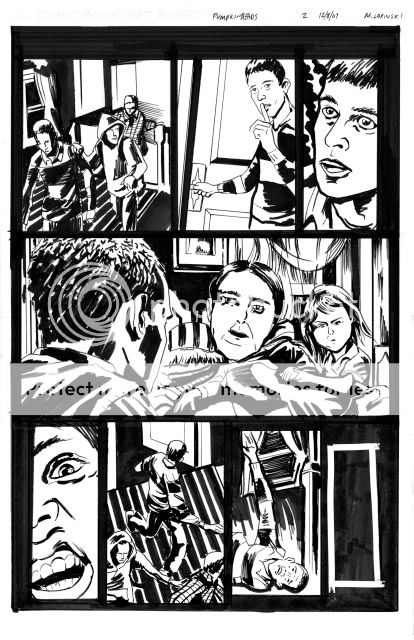
I'll offer up the details of the assignment at the end of this post and my take on the homework in the post next week. For now, I'll share a first draft of a page from my mini-series to illustrate some points.


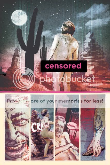
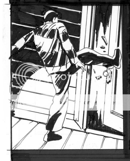
This was intended to be an opening page (Censored Bar courtesy of PhotoBucket image-hosting. What, no butts!?! This is Art, man.). There are a few things that the writers and I found confusing about it that caused us to re-work it and to re-think our opening sequence.

While we had wanted to create a sense of violence and mystery, there was some concern as to how well the page actually read. Is the character moving through a believable space? Is his action coherent?

It works in my mind's eye but some feedback caused us to wonder if I had unintentionally broken the 180 degree rule and marred the flow of action and if it was clear where the guy gets the rock from in panel 4.

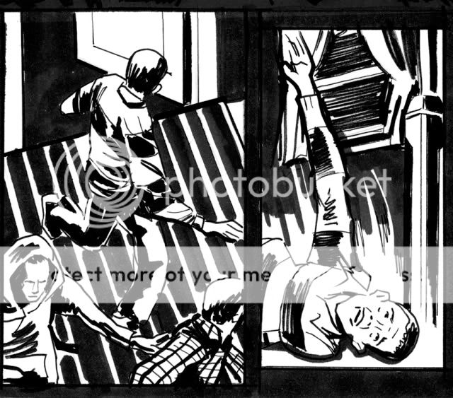
In its re-working (can't share that art here right now) I believe we resolved the issue by including a wider establishing shot, another panel placing the character in the locale, and another setting up the rock debris so the reader can know it's there before its used in the final panel.

With my homework assignment, the goal is to communicate the actions of 3 characters based on 18 panel descriptions across 3 pages. Although I was never an Archie fan, those pieces hanging around us smiled effortlessly back at us with their lean, clean, choices and economic delineations of volume and space.

Take a look over these details and then check in next week for the results to see how I interpreted them.