Wednesday, September 30, 2009

COMIC SHADING 01 _ A Confession

As a novice cartoonist, I've grown to appreciate the skill and sense of design it takes to render a book strictly in black and white. Using only the interplay of positive and negative shapes, hi-light and shadow, the goal is to build believable spaces and graphically interesting compositions. There are masters like Alex Toth who make it look natural and easy and modern talents like Mike Mignola and Eduardo Risso who make it look fun.

Me? I'm not quite there yet.

Of two of the longer stories I've illustrated in black and white, one takes place in a Himalayan Monastery and the other is a Glasnost-Era thriller. It seemed natural to render them both in deep blacks and frosty whites but as I began to illustrate I found that the planes of space were looking confused and faces muddied. I had been so accustomed to drawing with line, modulating thick and think outlines to suggest volume or space, that I needed more practice to "draw" with shadows.

While not as bold a treatment as I had wanted, I changed gears and approached the pages with another solution: zip-a-tones. The mechanical polka dot fields mythologized by Roy Lichtenstein, I had originally used zip-a-tone sheets in college in order to achieve pre-determined grey values printed on cheaper newsprint. This time, I created my own in Photoshop.

With examples below, you can see that besides helping to delineate space, I was able to employ the tones in achieving dramatic lighting effects to create tension.


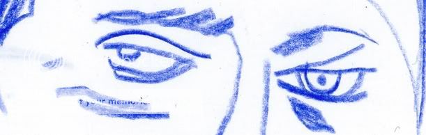
In the case of using them to shade figures, I soon found that less was more. Here, Lorraine is questioned in a dimly lit interrogation room.

The cast shadows of the first two examples appeared too harsh to me. In the third, I treated the hi-lights instead, glinting on Lorraine's features and lofting the smoke, like there was ambient light in the room. This one captured that balance of reality and graphic pop I was going for and I followed the same general technique throughout the tale.

Monday, September 21, 2009

CHARACTER DESIGN 02 _ Kill your Darlings

As a novice comic creator, I'm finding one of the most basic challenges to be maintaining a consistent look for each character and to retain their likeness throughout the strip. Initially sketching up a character turnaround helps to solve the likeness issue but I feel like I broke the rule of style for one of the Cold City characters.

In the Oni Talent Search script, Antony Johnston describes the character of Waddel as such:

Waddel is middle-aged, balding and very overweight.


So, based on the style I established with Lorraine I set forth and drew the version on the left. English, oily, and a man with secrets.


I wasn't satisfied and in my doodling I arrived at the more spontaneous version on the right. To me, he possesses more sinister charm, life in dead fish eyes, and the jowls of a leader.

I fell in love with a drawing (YES!). The problem is, he didn't fit the rest of the style. I may still want to revisit the strip in a more abstract line but he now sticks out like a sore thumb to me.


In writing, Faulkner advised to "kill your darlings." Eliminate any elements, possibly beautiful in their own right, that don't suit the whole. In the short turnaround to complete these pages, I opted to save old fish face and I think the cohesion of the world I created suffers a little for it.

Thursday, September 17, 2009

CHARACTER DESIGN 01 _ You'll Be a Woman Soon

When comic creators are asked about their chosen medium, a common reply is that creating comics is like making a movie with an infinite budget. That being the case, comic artists do not get enough credit from the general public for the way they must perform as casting director, cinematographer, set designer, costume designer, editor, and special effects supervisor for each and every panel.

In terms of casting, characters can be drawn somewhere on a scale from basic happy face dots and curves to something approaching photorealism. These comic players must communicate the story and connect emotionally with the reader. While the superheros of mainstream comics may be delineated by bold wardrobes, I've found it to be much more challenging and rewarding to bring an identity to an ordinary person.

In the case of the Oni Talent Search, writer Antony Johnston included detailed descriptions of his principal characters in the panel text of his sample script. Here's what he had to say about the lead female of the sequence:

This is LORRAINE BROUGHTON, also an MI6 officer. Lorraine is in
her late 30s, with long dark hair tied back in a ponytail. She's very average-looking, neither attractive nor unattractive; exactly the sort of nondescript features that suit a spy. Lorraine is dressed conservatively, in a below-the-knee skirt, blouse, overcoat and low-heeled shoes, with a scarf wrapped around her neck against the November chill. She carries a satchel-style shoulder bag.

Without ever having talked with Antony, that's all I had to go by.

Below, you can see the progression of some of my sketches that helped me arrive at the design I finally went with.


Drawing 1: There's a tip in the old "How To Draw Comics The Marvel Way" guide that the more lines you add to a woman's face, the older she will appear. This seems self-evident, but you can descend down that path pretty quickly as you try to add detail. Although I like how the first drawing seems hard and no-nonsense, she appeared to be too old and lean for Antony's description of Lorraine.

Drawing 2: I had experimented with the idea of drawing the test in a more graphic, geometric style. Like a Euro-Dick Tracy. Again, this did not feel like Lorraine to me with these teen model, spider monkey proportions. It's as if Jennifer Garner were playing the part. Nice, but no Lorraine.

Drawing 3: The sample script clearly places the action in England and Berlin and I always thought it would be best if the characters actually looked English. Artist Alex Maleev was one of the first artists I saw capture the Russian ethnicity of Marvel's Cold War anti-heroine The Black Widow (now played by Scarlet Johansen). Alex often uses photo-reference for his characters. For Lorraine, I cast English actress Emily Mortimer. She's the right age and appearance.

I decided that this third drawing was the proper degree of likeness and abstraction and was "non-descript" enough but would be someone I'd want to look at over the course of an entire graphic novel.


Now, it's up to the reader (and Oni) to decide if it works for them and the story...


Monday, September 14, 2009

COVER CHALLENGE 01 _ DMZ

In my COVER CHALLENGE posts, I'll be illustrating a mock comic book cover in the prevailing style of a popular series and then illustrate a second design that proposes an alternate art direction.

For my first entry, I'm tackling Brian Wood's Vertigo Series DMZ.

An accomplished designer and artist in his own right, Brian immediately distinguished his series from other books on the rack by eschewing bright figurative action shots for rough-hewn graphic explorations in a limited palette and with a lot of negative space. DMZ is set in a fictional post-war New York and the covers initially incorporated the local flavor of NYC iconography and signage with the visual immediacy of agit-prop fliers. The book seemed to be an artifact of the world he created.

While I always appreciated the bold choices and execution of these designs, I always felt slightly removed from covers that sold the world of the book but often excluded the central character and my sympathy.

Here's my stab at a DMZ design in the original vein but re-imagining the logo as a subway scratch tag, swapping the prevalence of white for black, and creating an interior mental space for protagonist Matthew Roth with the subway signage.


More recently, John Paul Leon has taken over as regular cover artist. His tenure has brought more, but muted, color and more figures to the cover design. But, often portrayed in silhouette, the people are still unknowable and become part of the artfully broken landscape. His work is tasteful and takes unexpected chances with composition.

For my second take, I decided to go HOT. I wanted to create an image with real sense of risk and blood in it. Something that communicated the daily, almost routine, peril Matt finds himself in and that still felt like New York. DMZ has never used an extreme close-up for a cover and this is my snapshot right in the sweaty face of our terrorized photojournalist.


Sunday, September 6, 2009

COVER DESIGN 02 _ Dino Tales

Early in the process of designing our graphic novel, I became hooked on the idea of using skulls to illustrate the theme or plot of each issue in Dia de los Muertos-styled vignettes. With the desert as a setting, hunger as a motivating concept, and with tough men and beasts as key players in our tale, an inverted take on the classic Jaws poster seemed like a good fit.


The intention was for the skull to be a heatstroke hallucination of a wolf going in for the kill. Since we're so accustomed to seeing dinosaur skeletons, and with predators like T-Rexes attacking from above, we instead got a lot of questions about having a dinosaur on the cover.


Here are some examples of the evolution of the cover from what now seems like a stiff, but anatomically correct, rendering of the wolf skull and an ill-defined silhouette in the first rendition to what I think are more effective apparitions in the third.


In the end, we scrapped the idea entirely but it made me push for clearer solutions and hopefully a better concept.

(NOTE: I'm posting tonight, and no new post this Thursday, because I'm heading away for a week to go swim with my dog)

Thursday, September 3, 2009

COVER DESIGN 01 _ Judge a Book


Here you have some more artwork from the pitch book I shopped around at NYC Comic Con 2009. In addition to sample pages and a full script for issue one, we decided to include cover comps for three issues. This seemed like the best way to communicate our mini-series as a fully fleshed out entity with an overarching design concept. It's one thing to have passion and a great concept, but, I've found that providing at least a taste of each aspect of your work helps in getting a complete stranger to see the big picture.

These are still raw, but, the final versions will continue to draw from Mexican Day of the Dead iconography and both woodcut printing and silkscreen processes for their aesthetic. An early decision was to try to avoid literal images and to instead create allegorical vignettes with skeletal actors to portray the theme of each particular issue.

I discovered the art of Polish Poster designs a few years ago and, with these covers, I threw down the personal challenge to meet their standard of bringing more mysterious, poetic, and outright nutso imagery into the world.

I've changed the cover to issue 1 pretty drastically since then because of one recurring comment: "Is that a dinosaur?" As cool as gunslingers fighting T-Rexes might be, they unfortunately do not appear in our story. I'll re-visit the evolution of that cover in the next post...